Coffee House Project
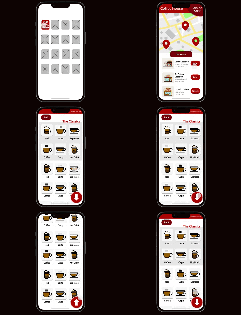
Image sampling of the resulting product imaging.
Introduction
This report relays a design process completed on July 11th, 2022, for Google’s UX Design Certification course, presented by Coursera. Creating this design demonstrated how a seemingly intuitive design is not always perceivable to all users. In fact, users often have their own system of organizing information in their minds, so it is important to create products that are adaptable to these preferences. The following walks through the scope and work involved in completing this project.
Product Overview
The Product
The app is designed to provide local coffee lovers with an easy way to locate one of Coffee House’s many locations and order their favorite drinks ahead of time. The app allows you to select and order drinks ahead of time as well as provides directions to walk or drive to the shop.
Project Duration
This project was conducted from January to May of 2022
The Problem
Many customers of Coffee House feel like they would like to get a quick cup of coffee for themselves or their peers, but they find it difficult to easily find a coffee shop nearby. Additionally, many coffee shops have a large, confusing menu with long, time-consuming waiting lines.
The Goal
Create a mobile app that will enable customers to find Coffee House locations and order drinks. This will satisfy customers who need a local coffee in a timely fashion by providing clear directions to the nearest location and by skipping the line by ordering ahead.
My Role
I was the UX designer who conducted all general aspects of the design process for Coffee House’s mobile app. This included data collection, creating designs, and presenting the findings and final products to be built out by mobile app developers.
Responsibilities
My responsibilities included all tasks that support the design thinking process: empathize, define, ideate, prototype, and test. User research, competitive audits, data synthesis, wireframes, and high-fidelity prototypes were required to achieve this.
User Research
In order to create designs that are helpful to users’ most important values and needs for a product, it is important that a UX designer is able empathize with their struggles. Accurately understanding the user pain points will determine the priorities of the design to meet those needs.
The primary way this was achieved was through conducting user research interviews. This created an environment where users could be asked lots of questions for their input. This enables the designer to become more observant, actively listen, and have an open mind, all the while seeking to be aware of how research affects UX designers and the users the app would be designed for.
Pain Points
Time Crunches
Customers showed frustration with many coffee shops they know to be far away. The app needed to be designed to make it easy to find the closest shop in a pinch for time.
Confusing Menus
Customers consistently expressed being overwhelmed by the amount of menu choices at many coffee shops. The design needed to offer an easy alternative for users to order their favorite drink.
Long Lines
Customers shared that the long lines to place orders at the cash register could be just as much of a time constraint as getting to the shop itself. The design needed to offer a way to order ahead to skip the line.
Complex Technologies
Some call-in customers have been frustrated by being placed on hold or not being offered a call-ahead option. The design for ordering on the app needed the same simplicity as ordering in person.
Personas
A couple of User Persona cards were created to help provide a sense of who the app was being designed for. Below is the problem statement from “Matt” as an example.
Problem Statement:
Matt is an account manager who needs a reliable way to order and pick up coffee quickly and easily. This is important to him because he has many meetings with clients and little time for delays.
Persona for “Matt”
User journey map
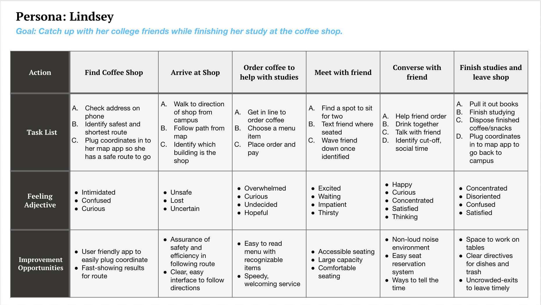
As mentioned earlier, a persona was also developed for “Lindsey.” The personas were created to support a sense of diversity in the app’s user base. Below shows the customer journey map she might experience in ordering coffee with Coffee House.
Customer journey for “Lindsey”
Starting the Design
Paper wireframes
In order to establish the clearly defined elements needed for the app, multiple versions of the elements were created and arranged in various ways to see which designs would resonate the strongest.
To the right are some example sketches that were compared and assessed for the homepage. The design in the top left ended up becoming the design that was used.
Digital wireframes
We wanted to ensure that one of the first things the user encounters when opening the app is the option to prioritize how they order based on proximity.
The app’s homepage displays features that allow them to see what Coffee House locations are close to them and the basic information they would need to know how to reach out to the location.
A major component of what this app provides above and beyond what traditional ordering can do is the ability to give the barista as well as the customer an expected time for the beverage to be ready.
Customers may have concerns that an app may not let them order in the funny ways they do when ordering in person. That is why a feature to add notes has been added.
Low-fidelity prototype
Figma was the tool used for developing the primary interactions of the user workflows within the app. Every page needed to be designed with a means to progress forward or undo an action to revert back to a previous page. This image to the right shows what some of these interactive features were directed to.
Refining the Design
In the first of the two rounds that were conducted, it seemed that a recurring theme that needed addressing was the need for more instructions throughout the app as a whole. The mockups for the ordering displays were updated to accommodate this user need.
In the second of the two rounds that were conducted, it seemed that another recurring theme that needed addressing was the need for a more prominent order display. The mockups for the GPS/Order Status display were updated to accommodate this user need as well.
Accessibility considerations
For users who may be visually impaired, it can be helpful to have direct buttons that replace gestures such as swipe or scroll. A “down” arrow was included in the scroll portions so that users who use Voice Over settings can easily double-tap to scroll down to view more app content.
Another recommendation that was applied during the peer review process was the note of contrast for buttons. Too many of the interface elements were the same color of red to match the logo color. To improve ease of scanning content, contrast in many buttons and displays were increased.
Some navigation links were initially vague in conveying their specific purpose. Link labels have since been updated to be more “action” oriented and specific to their context. For example, the “current order” link has been changed to say “view my order.”
Takeaways
Impact
While those who have reviewed the project continue to provide unique and insightful suggestions to improve the design, the overall reception of this project has been positive. People enjoy the style guide that was applied as well as the unique features such as the “order status” button.
Lessons learned:
The process of coming up with this design has lead to a couple of insights:
Simple is not always better. Don’t always assume an intuitive design is perceivable to everyone.
Users each have their own system of organizing information in their minds. Be adaptable.


