Wellstar Health System Website
Overview
As Georgia’s largest and most integrated healthcare system, with over 25,000 team members dedicated to delivering top-tier service to thousands of patients, it is imperative that Wellstar maintain this same level of excellence in the digital space.
This priority has led to experimentation for exploring a new digital experience for low-light conditions: a dark mode UI.
The Challenge
Dark mode designs require more than simply inverting brand colors according to lightness. While this may result in UI with accessible contrast levels, the inversions can produce some very harsh results.
In order to create a polished dark mode experience, the design needs to balance colors softly, yet legibly.
Role & Responsibilities
UI Design:
Utilizing visual design skills and resources to create color palettes that are less harsh, analogous to the Wellstar brand, and uphold accessibility standards.

UX Research:
Empathizing with user’s preferences through Jakob's Law to provide a dark mode experience similar to dark modes encountered on other sites.


Usability Prototyping:
Producing interactive prototypes to gain qualitative data from users to test the resulting design.
Process
For this project, I followed the classic UX design process.
1
Empathize
What pain points is the user encountering?
2
Define
What makes an effective, polished dark mode experience?
3
Ideate
How might we find inspiration and make it “Wellstar?”
4
Prototype
How will the user turn on the dark mode and test it out?
5
Test
What user feedback determines success?

Empathize
Jakob’s law states that users tend to expect your site or app to behave the same way as the other sites apps they have encountered before coming to yours.
→
Upholding this UX principle was essential to creating a dark mode that is approachable for the average user. The final design places a global toggle at the top right of any given page, a common practice for sites offering the feature.
→
Give the users a choice
Define

A toggle is easily discoverable to suit the user’s preference. This empowers the user to have the experience most familiar to them.

Present unique color palettes
The dark mode UI uses analogous colors to the Wellstar brand and excludes the use of pure black/white or deeply saturated colors.

Use lightness for elevation
Dark mode components such as cards and modals utilize surface colors lighter than the background to convey depth and visual hierarchy. Shadows are not as heavily relied upon.
Ideate
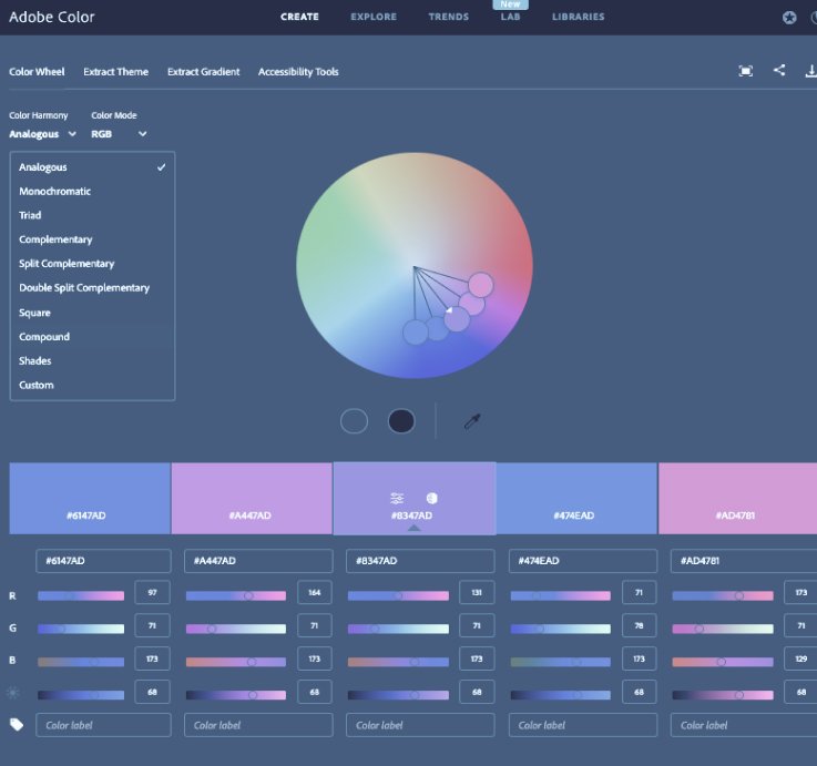
To create the perfect dark mode color system, a multitude of resources were utilized to collect inspiration, generate colors, and test color pairings for harmony and accessible contrast.

Mood board

Sandbox

Adobe color

Contrast tools
Prototype & Test
In order to test the discoverability and usability of the feature, a basic prototype was created to test users in engaging the dark mode feature.
Gorilla testing was performed on three users, all three of which found the concept intuitive and appealing to use.

Personal Challenge
While the dark mode design could have been designed with basic color style functions, I wanted to go above and beyond by giving myself a personal challenge to take this design challenge as an opportunity to incorporate some of the latest capabilities Figma design software launched at their Config conference in 2023.
This design was built with a color variables, which chain-link color decisions, allowing for quickly switching between dark and light modes.

Outcomes
In attending night school to obtain my Master’s in User Experience Design, I often relied on dark mode displays to be able to work comfortably in low light settings. For this reason, this project was a true passion of mine to complete. Below are some of the outcomes of this project.
A working dark mode toggle prototype
A Wellstar brand analogous dark mode color palette
Increased skill in utilizing Figma variable systems


